
Why UI Design Principles Matter for Your Business Website
Many business owners think UI design is about making a website look attractive. That is part of it, but the real value runs deeper. Strong UI design directly affects three business outcomes.
- Trust. When a website looks polished and works smoothly, visitors assume the business behind it is legitimate and professional. A Stanford University study on web credibility found that 46.1% of consumers assessed a website’s credibility based in part on its visual design. If your site looks outdated or breaks on mobile, potential customers question whether you are still in business.
- Conversions. Every design decision either helps visitors take action or creates friction that stops them. A button too small to tap on a phone. Text too light to read comfortably. A navigation menu that hides your most important pages. Each of these small failures compounds into lost leads. Good UI design removes these barriers and creates a clear path from “I am interested” to “I want to work with you.”
- SEO. Google evaluates websites based on how well they serve users on mobile devices, how quickly pages load, and how easy content is to read and navigate. These are all UI design considerations. A website built with responsive design principles tends to rank higher because it delivers what Google’s algorithm rewards: a good user experience.
For a small business owner who cannot afford to compete on advertising spend, a well-designed website is the single most cost-effective marketing asset you can build. It works 24 hours a day, seven days a week, qualifying visitors and generating leads while you focus on serving your existing customers.
What Is Mobile-First Design?
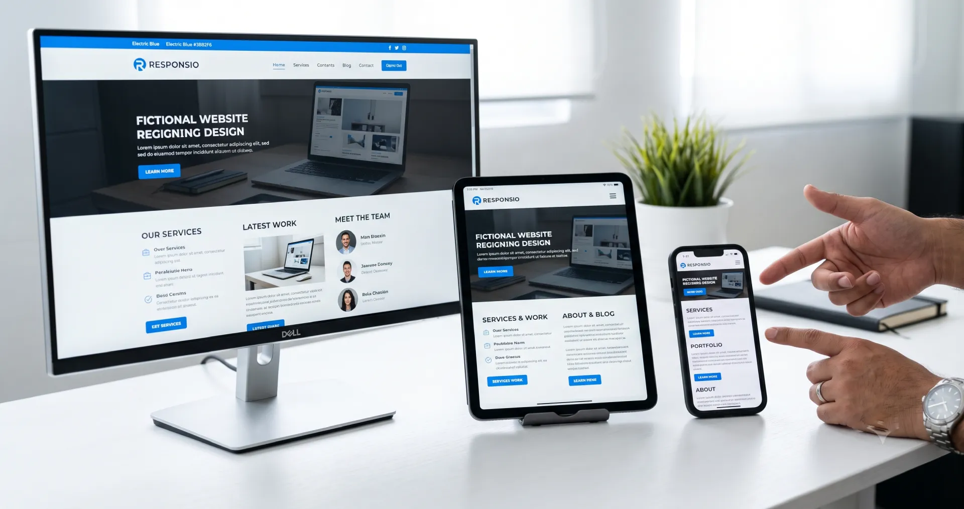
Mobile-first design means designing for the smallest screen first, then progressively enhancing the layout for larger devices. This approach flips the traditional workflow of designing for desktop and then shrinking things down.
Mobile devices account for about 58.5% of global web traffic, and that share continues to grow. In the Philippines, where smartphone penetration is high but many users rely on mobile data rather than fixed broadband, the mobile share is even larger. If your website does not work well on a phone, you are losing more than half your potential audience.
The practical application starts with content priority. On a phone screen, you have room for about four or five visible elements before the user needs to scroll. Every pixel counts. You need to decide what matters most to your visitors and put that first.
Take a restaurant website as an example. On desktop, you might display the restaurant’s name, a large hero image, the full navigation menu, a reservation button, and a featured dish all above the fold. On mobile, you make choices. The name, a prominent “Book a Table” button, and a shortened navigation tucked behind a clearly labeled menu icon are enough. The hero image still loads, but at a smaller size so it does not push the call to action below the screen.
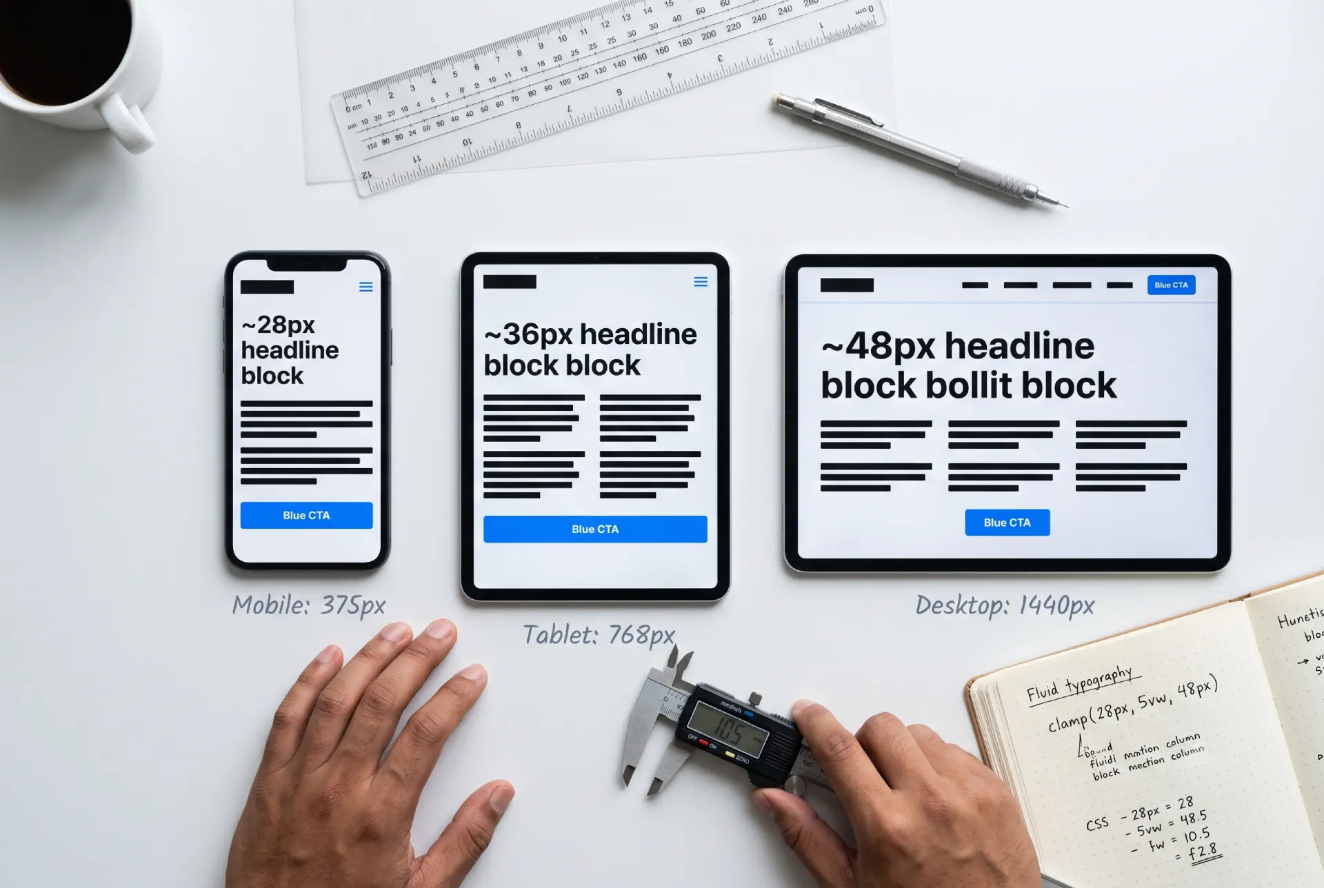
A real implementation on WordPress involves CSS media queries that activate layout changes at specific screen widths. At 768 pixels and below, your three-column service grid collapses into a single column, and your navigation switches from a horizontal bar to a collapsible menu. Modern WordPress themes like GeneratePress and Kadence handle much of this automatically, but you still need to review how your content stacks on a real phone.
One practical tip: test your site on an actual mobile device, not just by resizing your browser window. Layouts that look fine on a narrow desktop window often break on a real phone with different touch behaviors, screen resolutions, and connection speeds.
What Are Fluid Grids and Flexible Media?
A fluid grid is a layout system that uses relative units like percentages instead of fixed pixel widths. When columns are defined as “33% wide” rather than “350 pixels wide,” they automatically resize as the screen changes.
This is the technical backbone of responsive design. Without fluid grids, your site might look fine on a desktop monitor but require horizontal scrolling on a tablet. That sideways scroll is a fast way to frustrate visitors and send them to a competitor.
Consider a real estate website that displays property listings in a three-column grid. Each card shows a photo, the price, the address, and basic details like bedrooms and bathrooms. On desktop, three cards per row works well. On a tablet held in landscape orientation, two per row is better. On a phone, one card filling the full width is ideal because it gives each listing enough room to be readable without shrinking text or images.
Flexible media follows the same logic. Images and videos need to scale within their containers so they never overflow their boundaries. The standard fix is simple CSS applied to every image on the site: `max-width: 100%; height: auto;`. This tells every image to never exceed the width of its parent container while maintaining its original aspect ratio.
Videos require a bit more care. YouTube embeds, Google Maps frames, and other iframe content need to be wrapped in a container that maintains their aspect ratio at any width. Without this treatment, embedded videos break your mobile layout by either overflowing the screen or displaying at a tiny, unusable size.
These responsive layout techniques are the same principles applied in professional UI/UX design services: building interfaces that adapt without breaking.
What Is Scalable Typography?
Text is the foundation of web communication. If visitors cannot read your content comfortably, nothing else about your design matters. Scalable typography covers three things: font sizing, line height, and line length.
Font sizing. Body text should never go below 16 pixels. Most modern websites use 18 or even 20 pixels for body copy to improve readability across devices. Headlines need to scale proportionally larger on bigger screens. CSS provides a tool for this called `clamp()`, which lets you set a minimum, preferred, and maximum font size that scales smoothly with the viewport. A headline might use `clamp(28px, 5vw, 48px)`, meaning it never drops below 28 pixels, never exceeds 48 pixels, and otherwise scales at 5% of the viewport width. This single line of CSS replaces multiple media queries.
Line height. Crowded text strains the eyes. A line height of 1.5 to 1.75 times the font size creates comfortable vertical rhythm. On mobile, push toward the higher end because narrower columns benefit from extra spacing between lines to help the eye track from one line to the next.
Line length. The ideal measure for readability is 50 to 75 characters per line. On a full-width desktop monitor, text stretching from edge to edge becomes hard to track because the eye has to travel too far to find the start of the next line. On a phone, extremely short lines with only three or four words each create an awkward, choppy reading rhythm that disrupts comprehension. Most WordPress themes let you set a maximum content width (often around 700 to 800 pixels) that keeps text readable regardless of screen size.
Typography is also a branding tool. A law firm might use a traditional serif font like Merriweather to convey authority and stability. A creative studio might pair a clean sans-serif like Inter with a distinctive display font for headlines. Whatever you choose, limit yourself to two font families. Loading three or more families slows down your site measurably and creates visual clutter that undermines the professional look you are building.
How Big Should Touch Targets Be?
Mobile users navigate with their fingers, not a precise mouse cursor. This changes how you need to design every interactive element on your site.
Google’s Material Design guidelines recommend a minimum touch target size of 48 by 48 device pixels, with at least 8 pixels of spacing between adjacent targets. Buttons, links, and menu items all need to meet this standard, or you risk frustrating visitors who cannot tap what they are aiming for.
Consider a common real-world failure: footer links crammed together in a tight single line. On desktop, a visitor can click each one with pixel precision. On mobile, a visitor with average-sized fingertips will hit the wrong link about half the time. The fix is straightforward. Give each footer link enough vertical padding that it occupies its own tappable row, even if the links are arranged horizontally on desktop. The visual design stays clean, but the functional touch area expands to usable dimensions.
Navigation menus deserve special attention. The hamburger menu (three stacked horizontal lines that expand when tapped) is a familiar pattern on mobile, but it carries a known usability cost. Research consistently shows that hiding navigation behind a hamburger icon reduces how many pages visitors explore. If they cannot see the options, they are less likely to browse.
For sites with five or fewer main pages, an alternative approach is to keep the most important links visible at the top of the page in a short horizontal row that scrolls if needed. This gives up some screen real estate but gains higher engagement with your key pages. For larger sites, the hamburger menu remains the pragmatic choice, but pair the icon with the word “Menu” next to or beneath it. That small label significantly increases the percentage of visitors who actually use the navigation.
When you work with a UI/UX design specialist, these interaction details are exactly what get refined during the design phase, before development begins, saving costly revisions later.
What Is Visual Hierarchy?
Visual hierarchy is the arrangement of elements in order of importance. It tells visitors where to look first, second, and third. Without it, a page feels like a wall of equal-weight information with no clear entry point.
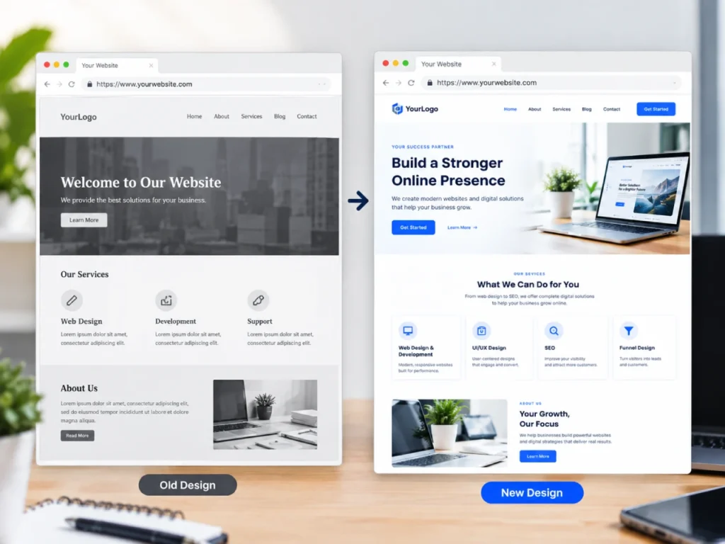
The tools of visual hierarchy are size, color, contrast, spacing, and position. A large, high-contrast headline at the top of the page signals where to start reading. A brightly colored button stands out from surrounding neutral elements and communicates what action to take next. White space around a specific section separates it from the content above and below, framing it as a distinct message worth reading.
Take a typical service business homepage as an example. At the top, a hero section contains a headline identifying what the business does, a subheadline adding a benefit or differentiator, and a call-to-action button. The headline uses the largest font size on the page with a bold weight. The subheadline is noticeably smaller and uses a lighter weight or muted color. The button uses an accent color that appears nowhere else in large quantities. This sequence (headline, subheadline, button) forms a visual hierarchy. The visitor’s eye moves through it in exactly that order, and the design itself, not just the copy, tells the visitor what to do next.
This same logic applies throughout the page. Section headings need to be visually distinct from body text. Client testimonials should look different from service descriptions. A pricing table should draw attention to the recommended option using a subtle highlight color or slight size increase.
Consistency is the second half of the equation. Once you establish that all H2 headings use a specific font size, weight, and color, apply that rule everywhere. When your “About” heading looks different from your “Services” heading two scrolls later, visitors register the inconsistency as unprofessional, even if they cannot articulate why. A consistent design language across your entire site builds trust through visual predictability.
How Do Images Affect Responsive Design?
Images are the single largest contributor to page weight on most websites. An unoptimized photo straight from a camera can easily exceed 5 megabytes. The same image, properly compressed and served in a modern format, might be 150 kilobytes. That is a 97% reduction with no visible quality difference to your visitors.
The business impact shows up directly in your conversion rates. Google’s mobile speed research found that 53% of mobile site visits are abandoned when a page takes longer than three seconds to load. On mobile connections, that threshold is even lower. For every unnecessary second your images add to load time, you are paying in lost leads.
What makes images specifically responsive is serving them at appropriate sizes. A 2000-pixel-wide photograph is wasteful on a 400-pixel-wide phone screen. The browser still downloads the full file before scaling it down. HTML provides the `srcset` attribute and the `<picture>` element to solve this inefficiency. You prepare multiple versions of each image at different widths, and the browser downloads only the one it actually needs for the current screen.
On WordPress, image handling has improved substantially. WordPress automatically generates multiple sizes of every image you upload (thumbnail, medium, large, and full). Your theme or page builder can then select the appropriate size for each context so your blog archive pulls thumbnails while your single post template pulls the full-width version. Plugins like ShortPixel or Imagify can automatically compress images on upload and convert them to WebP format, which produces files roughly 25 to 35 percent smaller than equivalent JPEGs without quality loss.
Lazy loading is another tool worth enabling. It defers image loading until the image is about to scroll into view, so the initial page load only downloads what the visitor can actually see. WordPress has included native lazy loading since version 5.5, adding `loading=”lazy”` to every image by default. If your WordPress installation is current, this feature is already working for you.
What Is Accessible Design?
Accessible design means your website can be used by people with disabilities. This includes visitors who use screen readers, people with limited vision who need high contrast, individuals with motor impairments who navigate by keyboard, and millions of users with color vision deficiency.
Accessibility is not a niche concern. The World Health Organization estimates that 16% of the global population experiences significant disability. That is over one billion people. Designing for accessibility means making your website usable for this substantial audience, and the improvements almost always benefit every other visitor too.
Four accessibility improvements produce the largest impact for the least effort.
- Color contrast. Text must have sufficient contrast against its background. The WCAG 2.1 AA standard requires a contrast ratio of at least 4.5:1 for normal text and 3:1 for large text. Light gray text on a white background fails this test, yet it appears on countless business websites. A free online tool called WebAIM’s contrast checker lets you plug in your colors and see immediately whether they pass. Most failing combinations can be fixed by darkening the text or lightening the background by a small amount.
- Alt text for images. Every image that conveys information needs a text description for screen reader users. For a photo of a team working in an office, good alt text might be: “Three team members collaborating around a whiteboard in a sunlit conference room.” Decorative images that add no information should use empty alt text (`alt=””`) so screen readers skip them entirely rather than announcing them as unidentified images.
- Keyboard navigation. Every interactive element on your site must be reachable and operable using only a keyboard. This is critical for people who cannot use a mouse due to motor impairment or visual tracking difficulties. Test this yourself by visiting your website, pressing the Tab key repeatedly, and checking whether you can reach every link, button, and form field. A visible focus outline should show which element is currently selected. Do not remove this outline with CSS. If the default blue outline clashes with your design, style a custom focus indicator that is equally visible while fitting your brand.
- Readable fonts. Body text at 16 pixels minimum with comfortable line height helps not only users with visual impairments but anyone reading on a small screen in bright sunlight. This is the same guideline covered under typography, which illustrates an important point: accessible design and good UI design overlap almost completely. When you build for accessibility, you build a better experience for every visitor.
How These Principles Affect SEO and Core Web Vitals
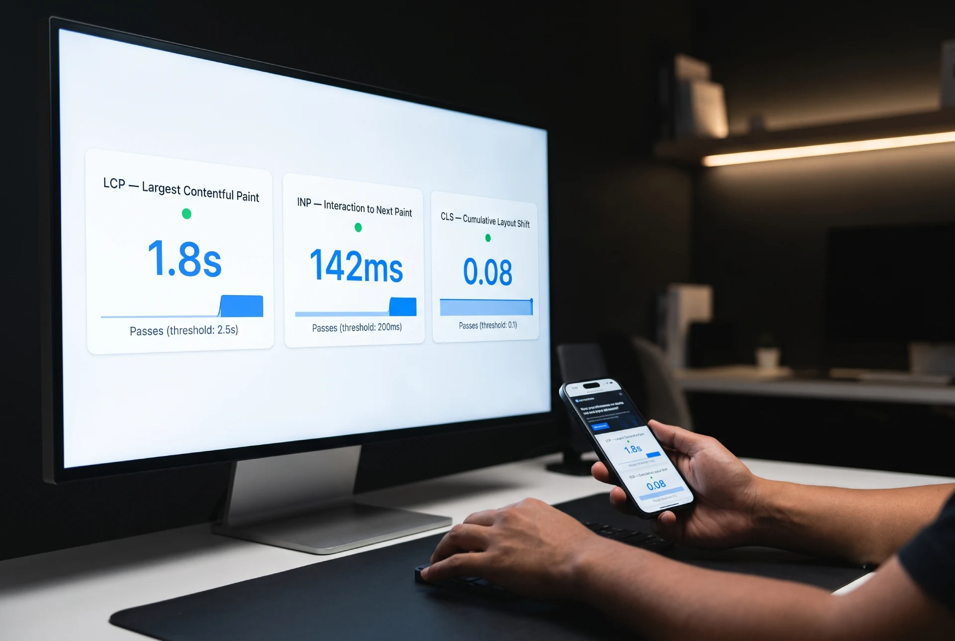
Google uses Core Web Vitals as part of its ranking algorithm. These are real-world performance metrics that measure loading speed, interactivity, and visual stability. Each UI principle discussed above contributes to one or more of these scores.
- Largest Contentful Paint (LCP) measures how long it takes for the main content of a page to finish loading. Google recommends LCP under 2.5 seconds. Optimized images are the most direct way to improve this metric. A properly compressed, correctly sized hero image loads dramatically faster than an unoptimized one. Fluid grids that prevent oversized image downloads also contribute.
- Interaction to Next Paint (INP) measures how quickly a page responds to user input like taps and clicks. Google recommends INP under 200 milliseconds. Touch-friendly navigation and accessible design both play a role here. A site with properly sized touch targets and lightweight JavaScript that does not block the browser’s main thread feels immediately responsive. Visitors can tap, scroll, and navigate without perceptible delay.
- Cumulative Layout Shift (CLS) measures visual stability. If you have ever been reading a page on your phone and the content suddenly jumped because an image loaded above and pushed everything down, you have experienced CLS firsthand. Setting explicit width and height attributes on every image reserves the correct amount of space before the image loads, preventing these layout shifts. Fluid grids that use consistent spacing also keep content stable as the page renders.
Beyond Core Web Vitals, Google has used mobile-first indexing for years now. This means Google evaluates every website based on its mobile version, not its desktop counterpart. A mobile-first layout is no longer optional. It is the lens through which Google sees and ranks your content. Websites that are not mobile-friendly simply do not rank in competitive search results.
For a deeper look at how design and SEO work together, read the guide on building a website with SEO built in from the start, covering site architecture, page speed, and on-page optimization as part of the design phase rather than after launch.
How Do You Implement These Principles on WordPress?
Most of the principles in this guide do not require custom code. They require intentional choices about your WordPress setup. Here is how to apply them step by step.
- Choose a responsive theme. Start with a theme built for modern web standards. GeneratePress and Kadence are lightweight, well-coded options that produce clean, responsive layouts without the slow performance of bloated multipurpose themes. Both are actively maintained and follow WordPress coding standards. The Astra theme is another solid choice, particularly for sites that want more pre-built template options. Whichever you pick, verify that it was last updated within six months. An abandoned theme is a security risk and will lag behind modern CSS features.
- Use a block-based editor for layout control. The WordPress Block Editor (Gutenberg) has matured significantly and handles responsive design well as of 2026. Each block includes responsive controls for typography, spacing, and visibility. You can set different font sizes for mobile, tablet, and desktop directly in the editor interface without writing CSS.
- Skip the mobile-plugin approach. I do not recommend plugins like WPtouch that attempt to create a separate mobile version of your site. This approach was standard practice a decade ago but now creates more problems than it solves. Modern responsive design renders this entire plugin category unnecessary. A single responsive theme handles all screen sizes from one codebase.
- Optimize images at upload. Install an image optimization plugin. ShortPixel and Imagify both automatically compress images and convert them to WebP format when you upload to the media library. For most business websites, 2000 pixels wide is more than enough for any display context.
- Add caching for real-world speed. WP Rocket is the most complete caching plugin for WordPress, handling page caching, file minification, and lazy loading in one package. For a free alternative, the combination of W3 Total Cache and a CDN service like Cloudflare produces strong performance gains.
- Test on a real phone. After implementing these changes, open your website on your own mobile device. Navigate through every page. Tap every button and link. Read your content from top to bottom. If something feels awkward or broken, it needs attention. Your visitors use phones. You should too.
What Are the Current UI/UX Design Trends?
Current UI/UX design trends include bold typography, glassmorphism, dark mode, micro-interactions, and AI-assisted personalization, but the most durable trend is a return to fast, readable, accessible layouts that work on every screen. Trendy visuals only help when they do not sacrifice load speed or clarity. For small business sites, the safest move is to borrow one or two current details and keep the responsive foundation solid, since Google and visitors both reward speed and usability over novelty.
What Do Responsive Web Design Services Include?
Responsive web design services include the planning and build work that makes a single site adapt fluidly across phones, tablets, and desktops: mobile-first wireframes, fluid grids, scalable typography, responsive images, and testing on real devices. The goal is one design that reads and converts well at every screen size instead of separate versions to maintain. If you want this handled end to end, my UI/UX design services cover responsive layout, visual hierarchy, and accessibility so the finished site converts on every device.